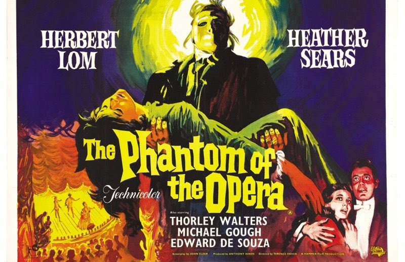
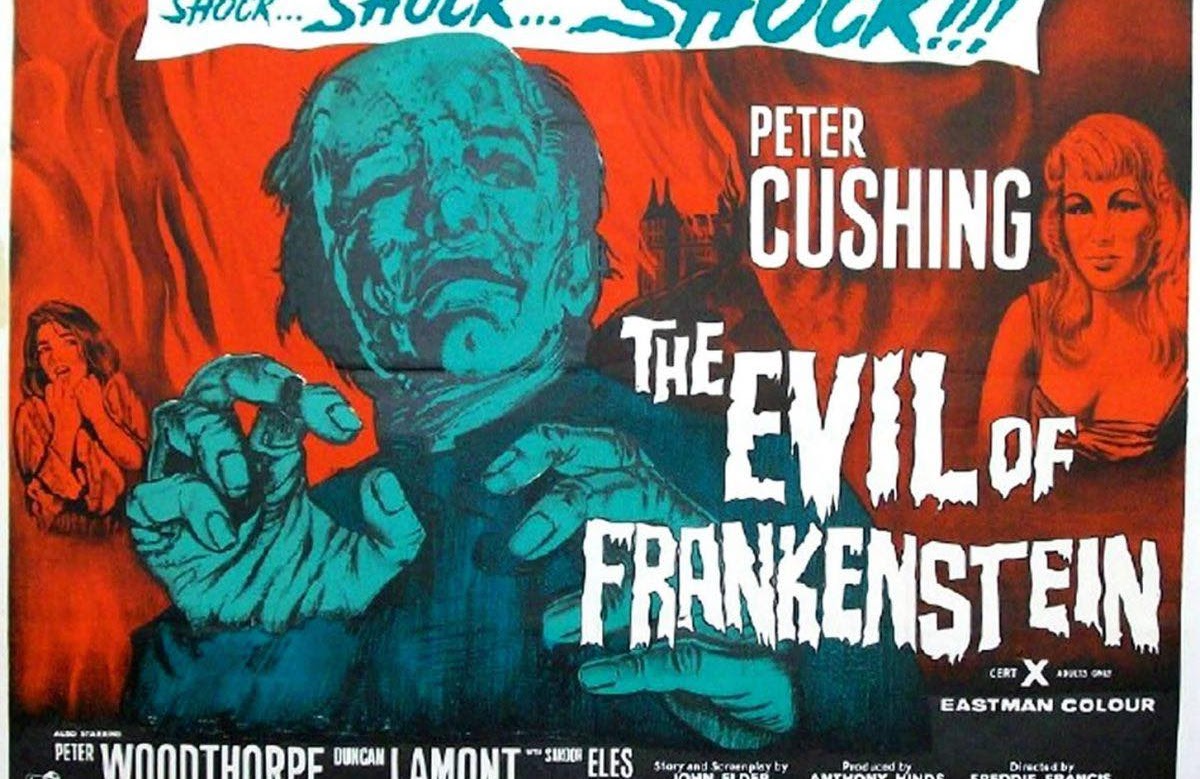
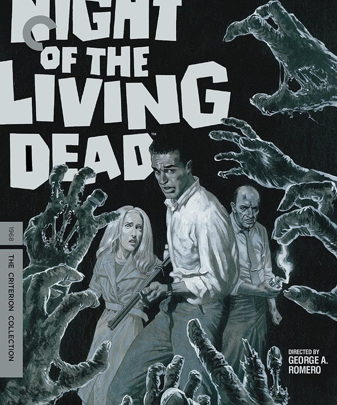
Night of the living dead
my film for this brief was Night of the living dead by George A Romero. I was already familiar with his work, having watched Dawn of the dead, The Dawn of the dead remake, Land of the dead.
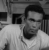
I watched the film and knew I wanted this guy to be a center stage character in it along with the woman. Since they carry a lot of the dialogue of the film especially in the first half. 30% through the film the dynamic changes and it feels like he becomes the main character. Which is an interesting thing to see in a film.
I watched the film and knew I wanted this guy to be a center stage character in it along with the woman. Since they carry a lot of the dialogue of the film especially in the first half. 30% through the film the dynamic changes and it feels like he becomes the main character. Which is an interesting thing to see in a film.

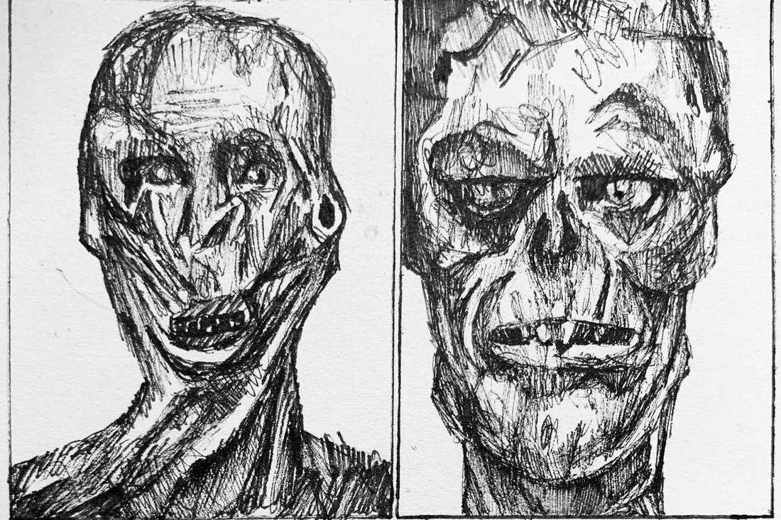
Thumbnails
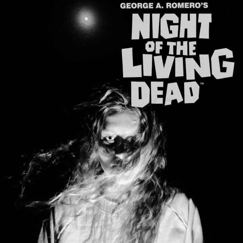
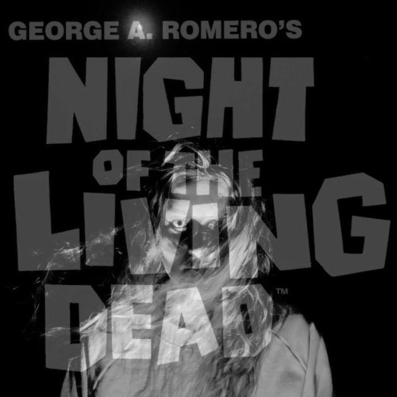
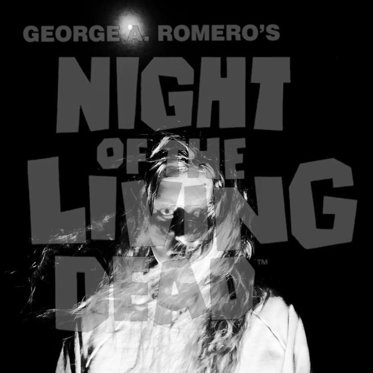
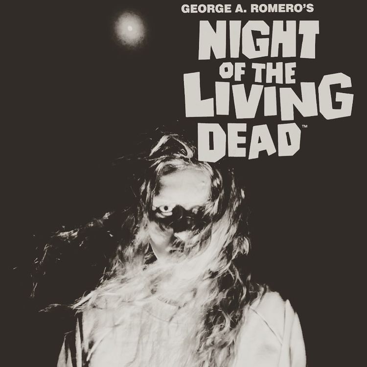
this is my thumbnail page, I experimented with different fonts and ideas
thumbnailing has really made me realized I'm really not that creative. Everyone has a way of coming you with ideas that impresses me.
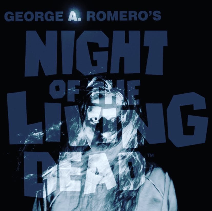
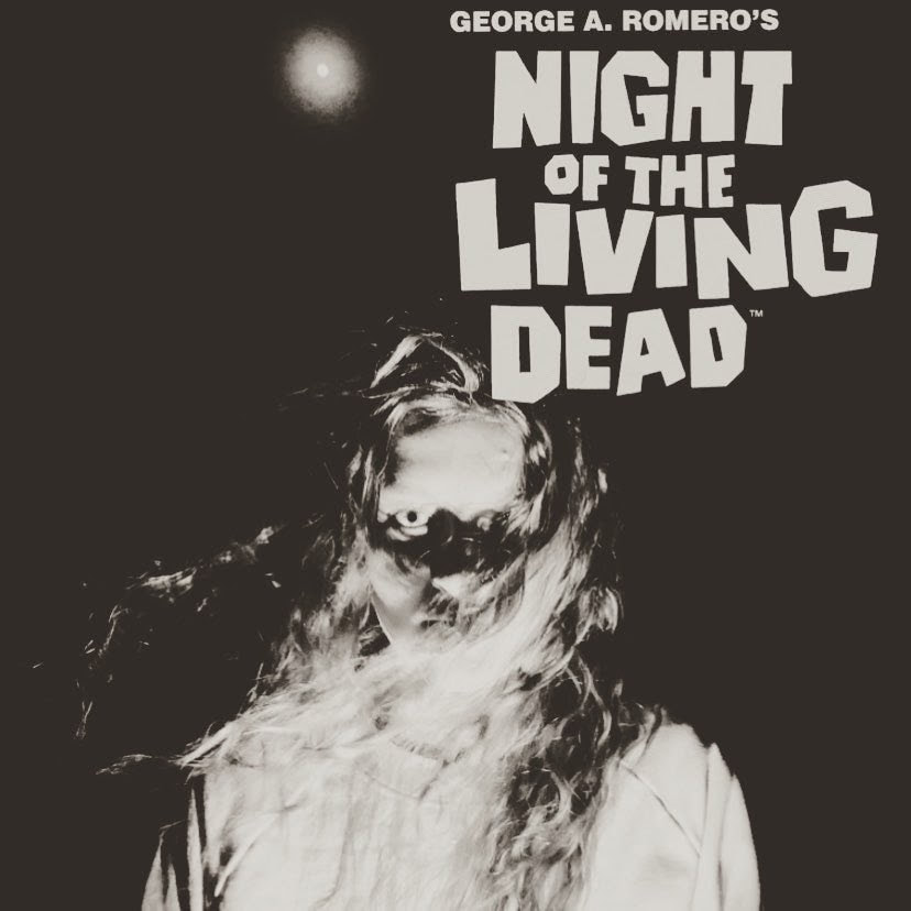
when it comes to which of these I'd pick as a final piece, It's hard to say, if probably turn these all over and say "pick your favorite". But since I have to go off my own gut in this.
I like the one with a dark vignette and the one which is just red. I personally aesthetically prefer the black and white vignette one but the blood-red one may be a more effective poster which grabs people's attention more: being more effective advertisement on that front.
thumbnailing has really made me realized I'm really not that creative. Everyone has a way of coming you with ideas that impresses me.
when it comes to which of these I'd pick as a final piece, It's hard to say, if probably turn these all over and say "pick your favorite". But since I have to go off my own gut in this.
I like the one with a dark vignette and the one which is just red. I personally aesthetically prefer the black and white vignette one but the blood-red one may be a more effective poster which grabs people's attention more: being more effective advertisement on that front.

|
|
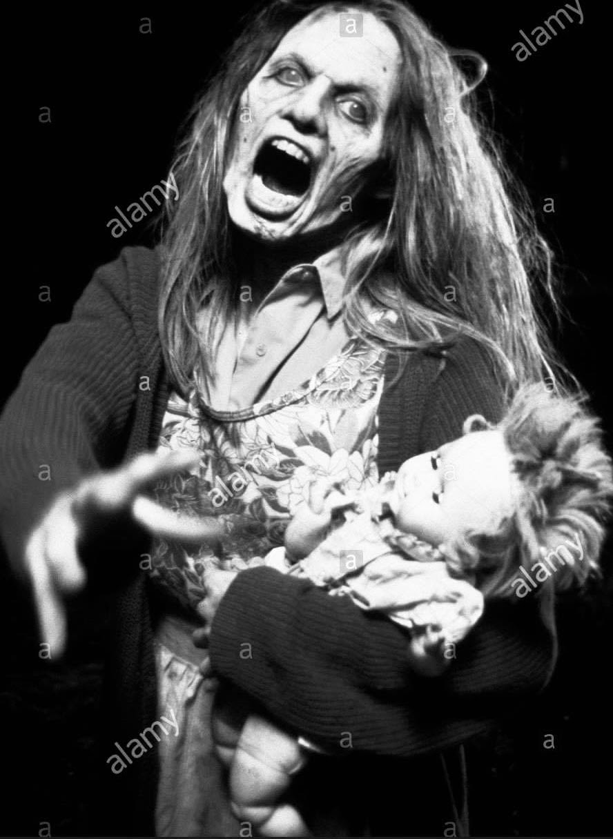
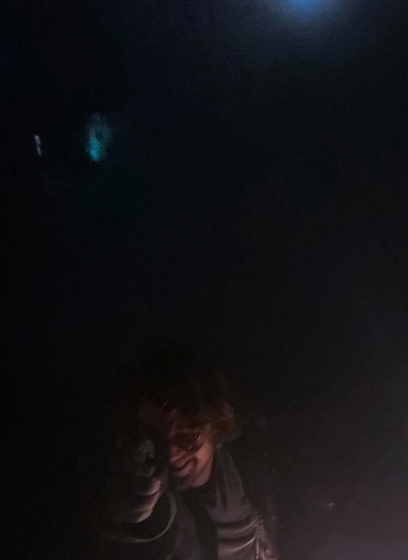
Photoshoot
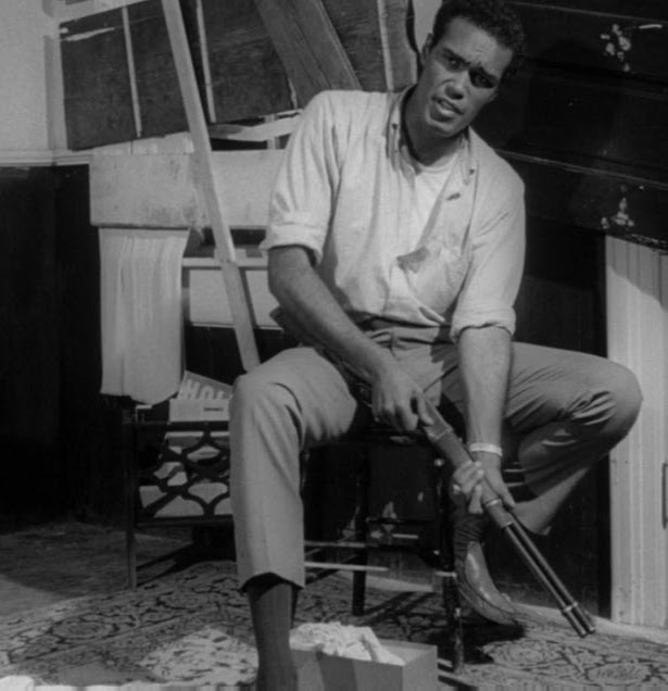
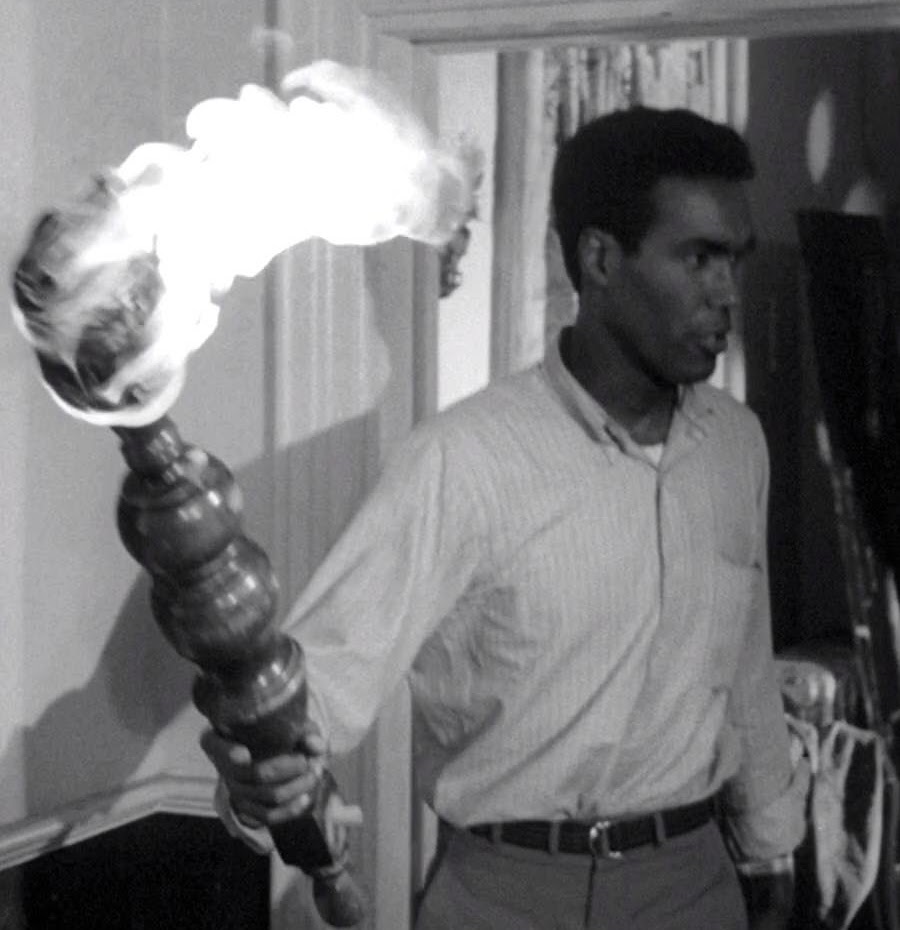
Considered at this time that the poster could just be a still image from a photoshoot where we use lighting techniques to make it look creepy and uncanny. some of the shots are a bit experimental and heavily edited, had the idea we could layer some of them to create strange images. But too much editing would go against the brief so I tried to keep it more restrained.
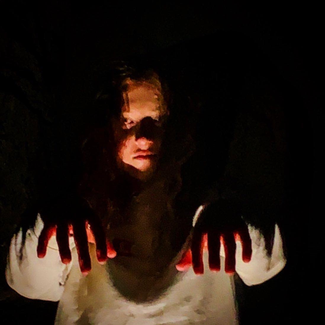
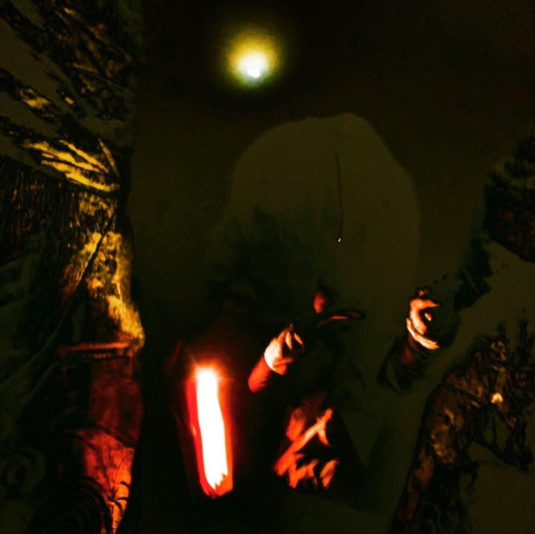
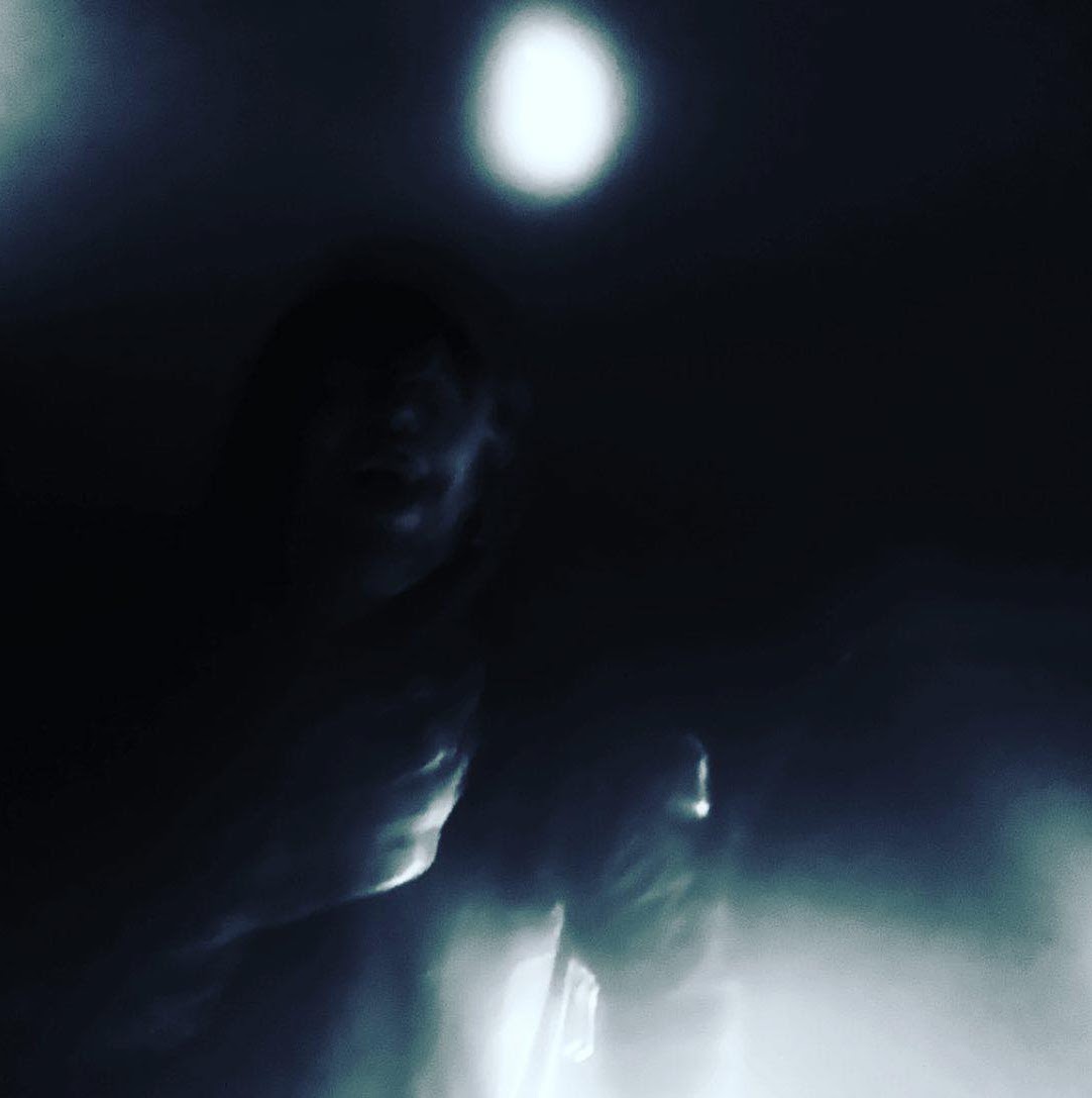
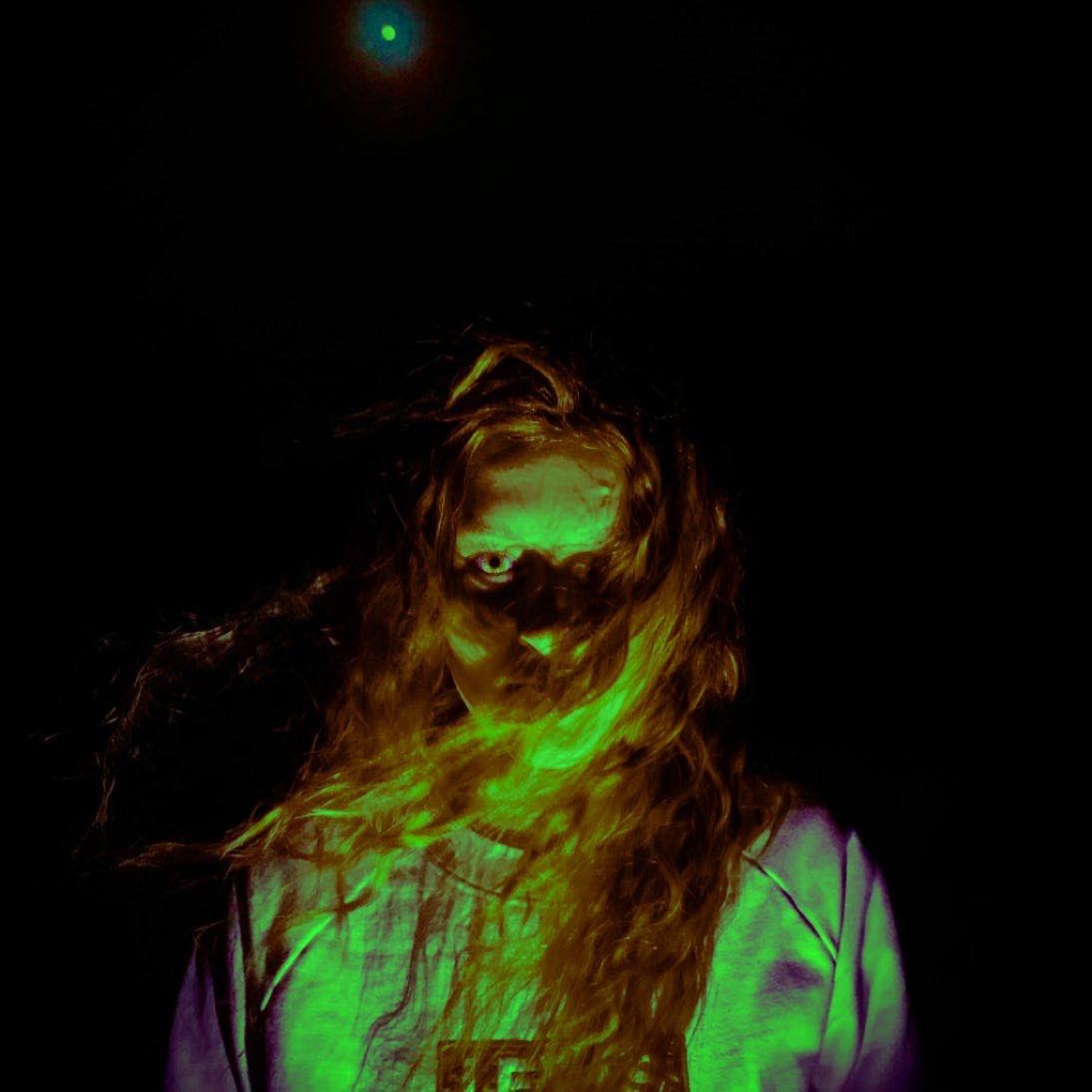
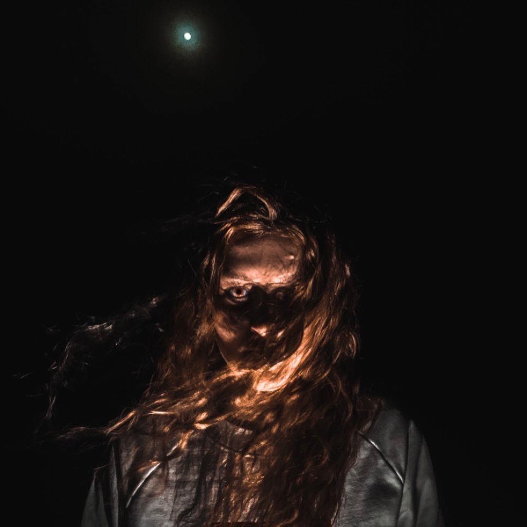


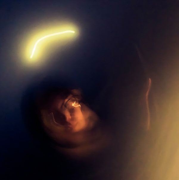
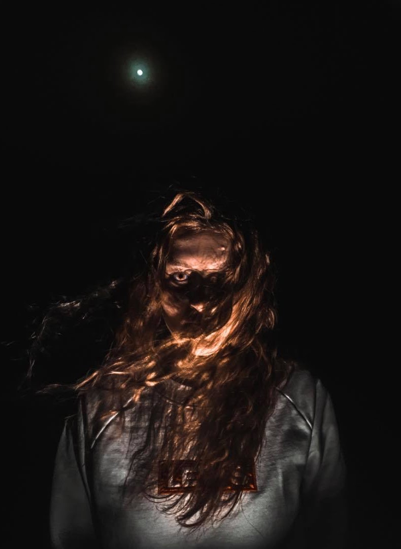
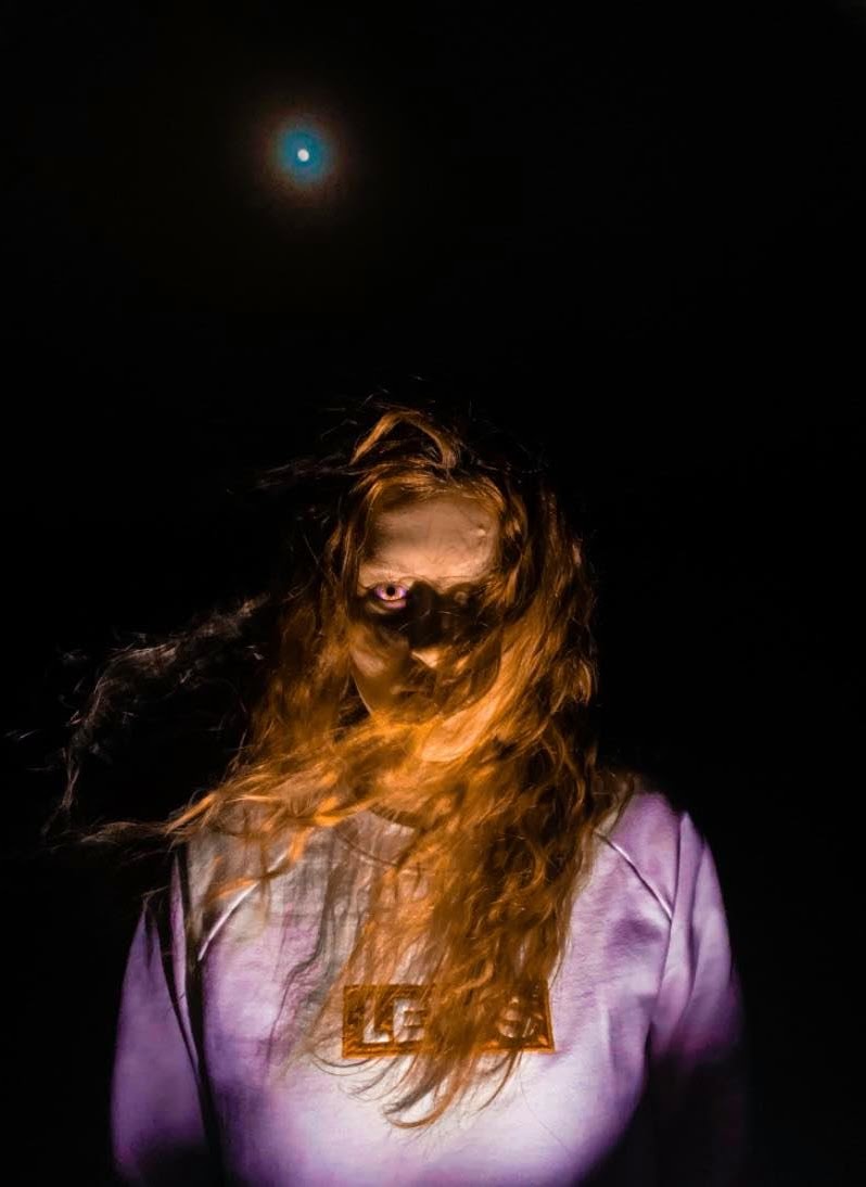
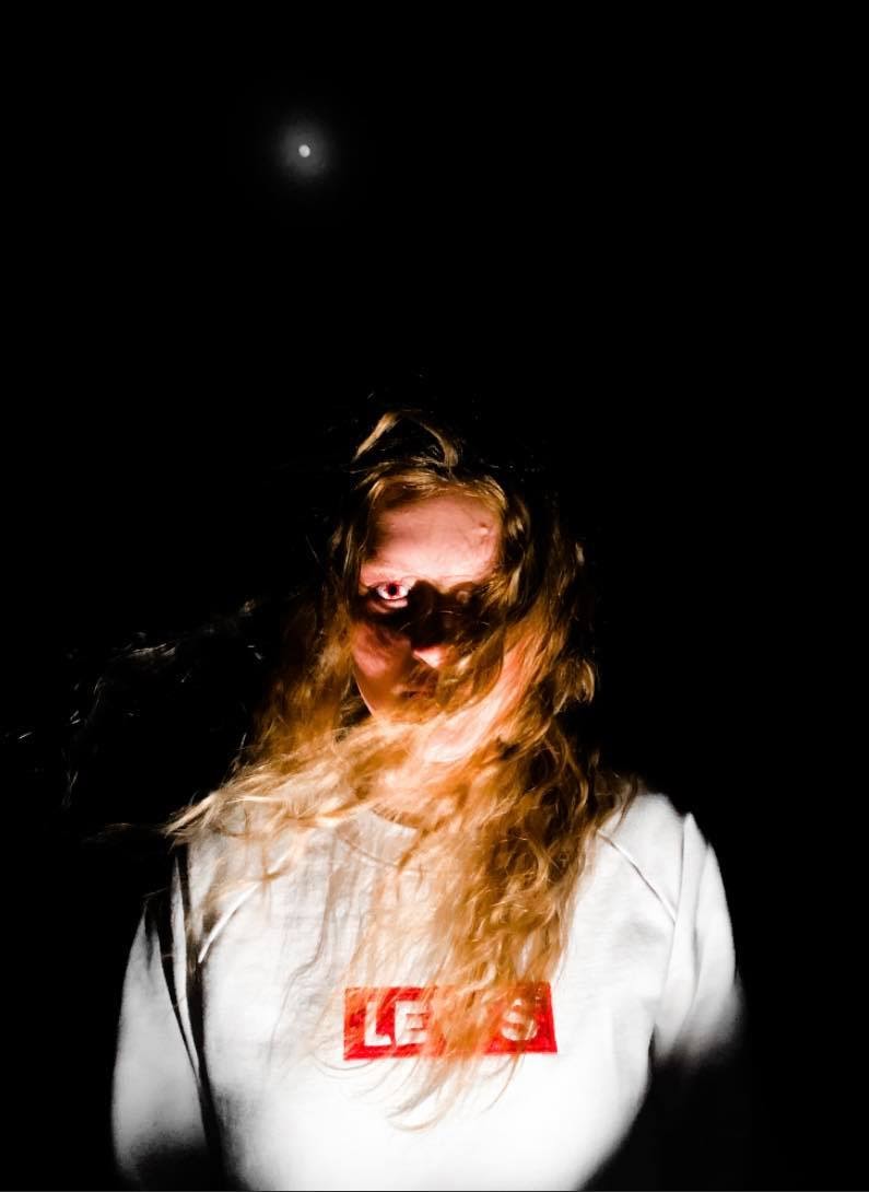
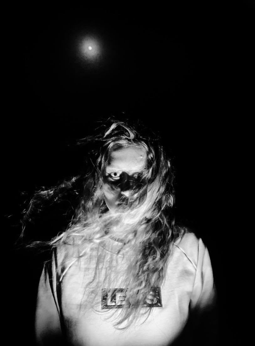
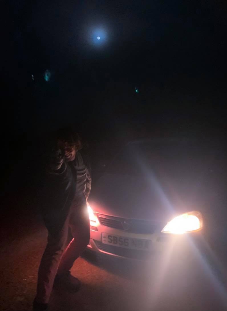
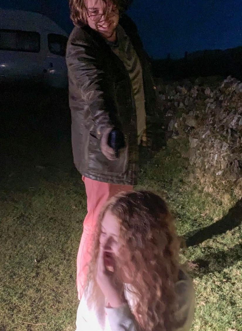
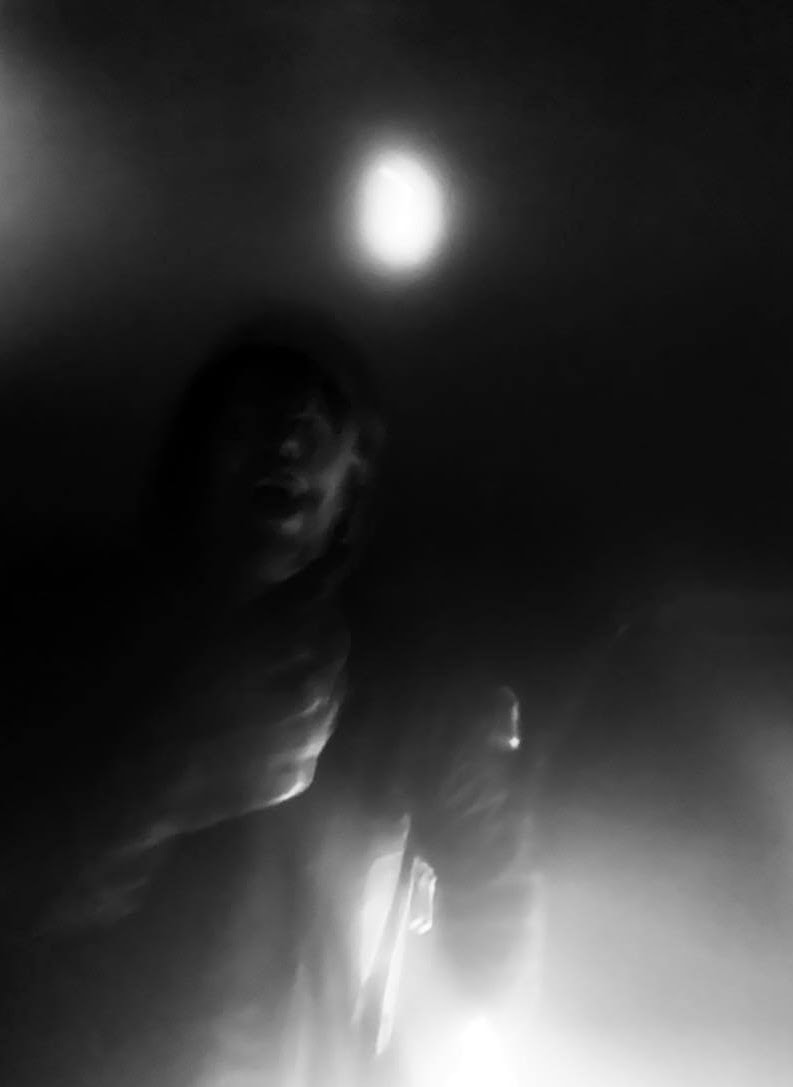
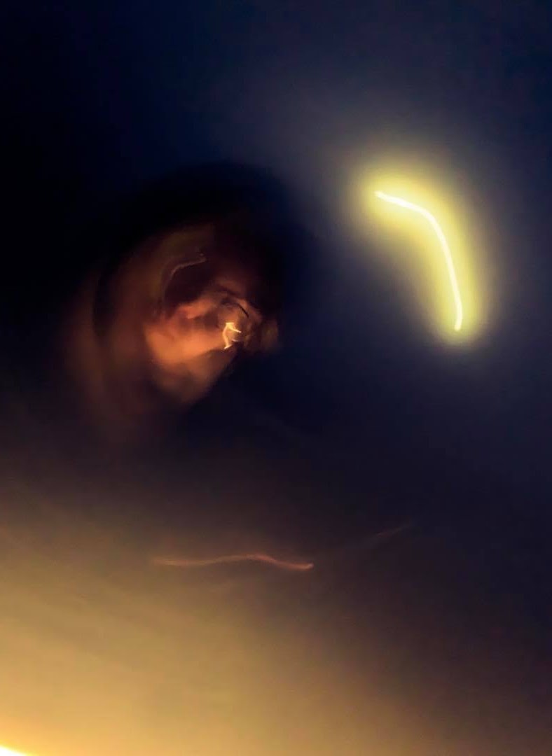
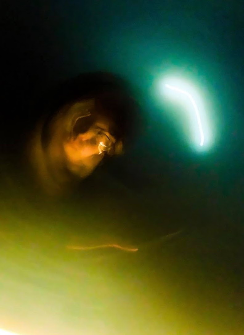
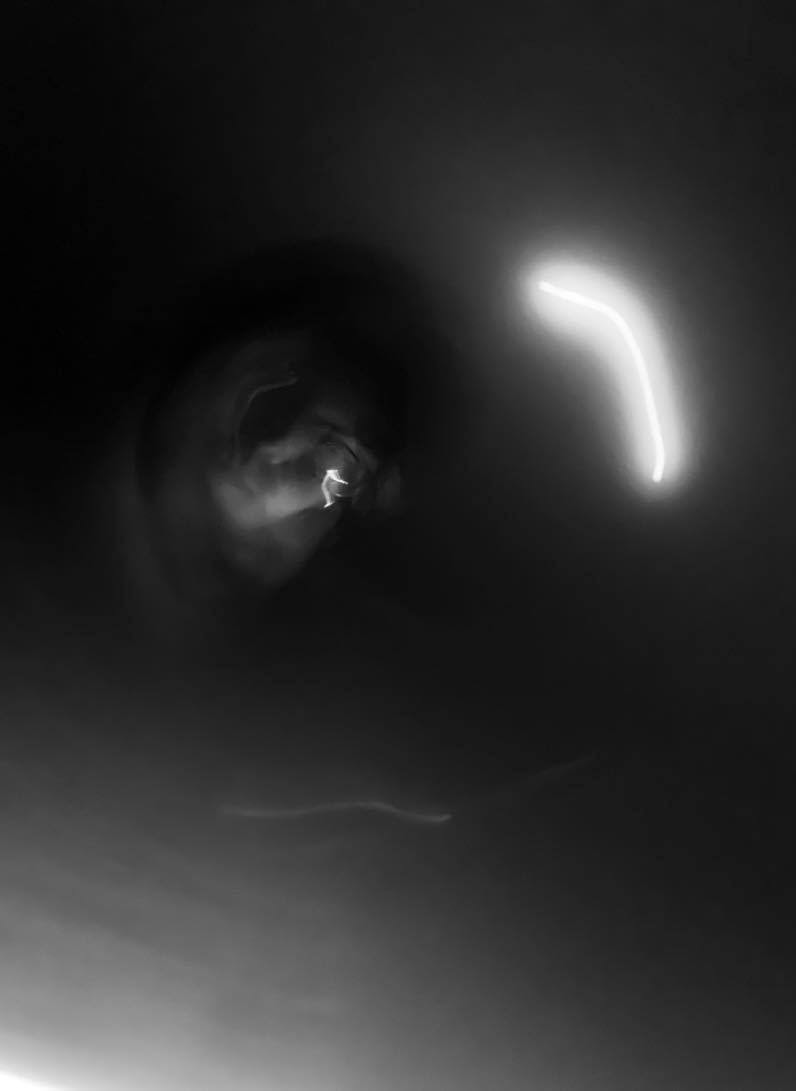
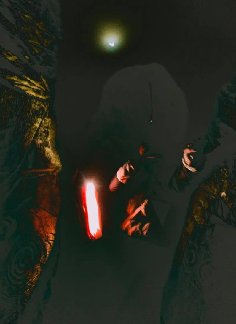
Best from the photoshoot
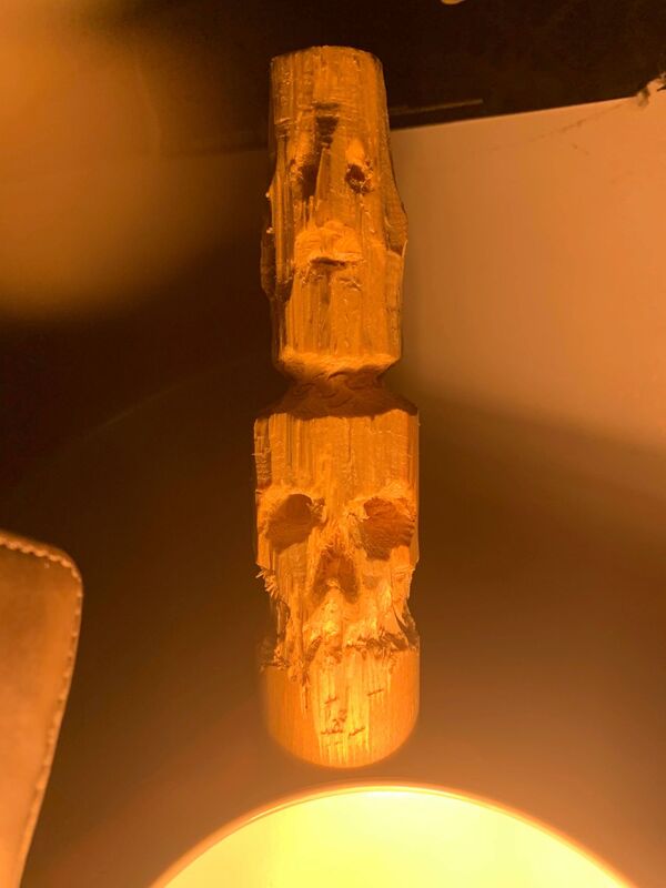
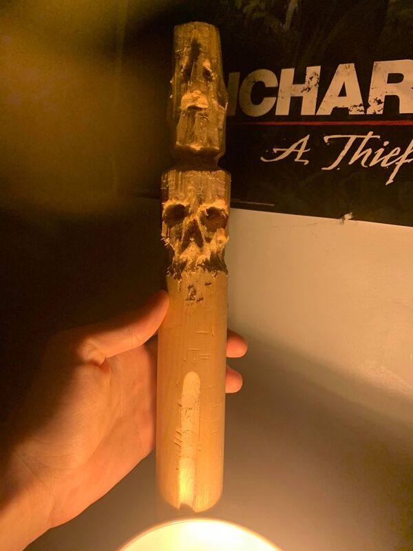
I got the idea to start carving a head and a skull out of a piece of wood so here's some images of that, this was an experiment and I try using it later on to see if it works.
|
|
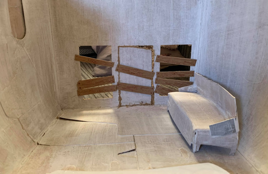
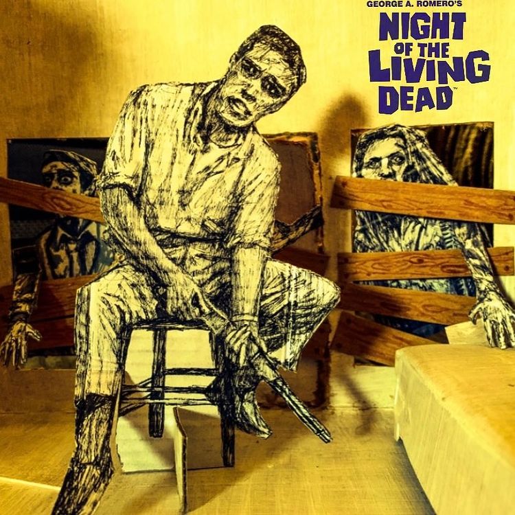
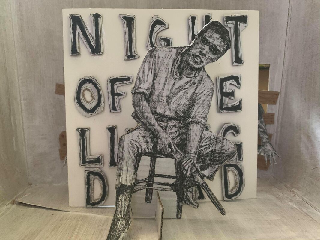
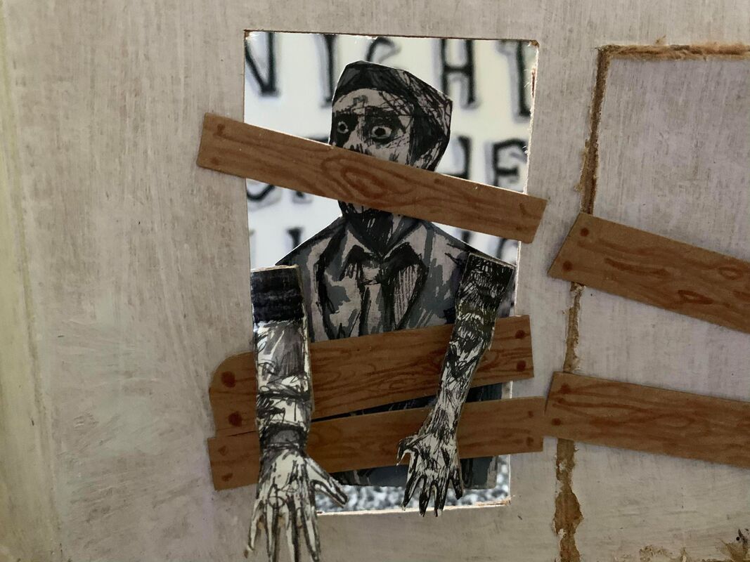
I put together a cardboard scene, boarded up the windows, made a couch. Then made cardboard Zombie figures and a figure of the main character, I then changed it cause it was too big and made one of him sitting down.
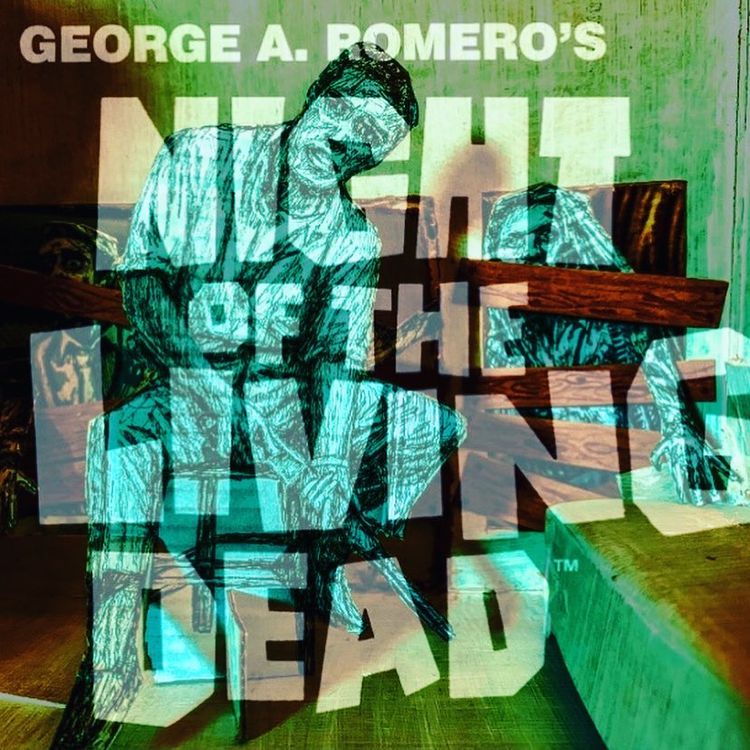
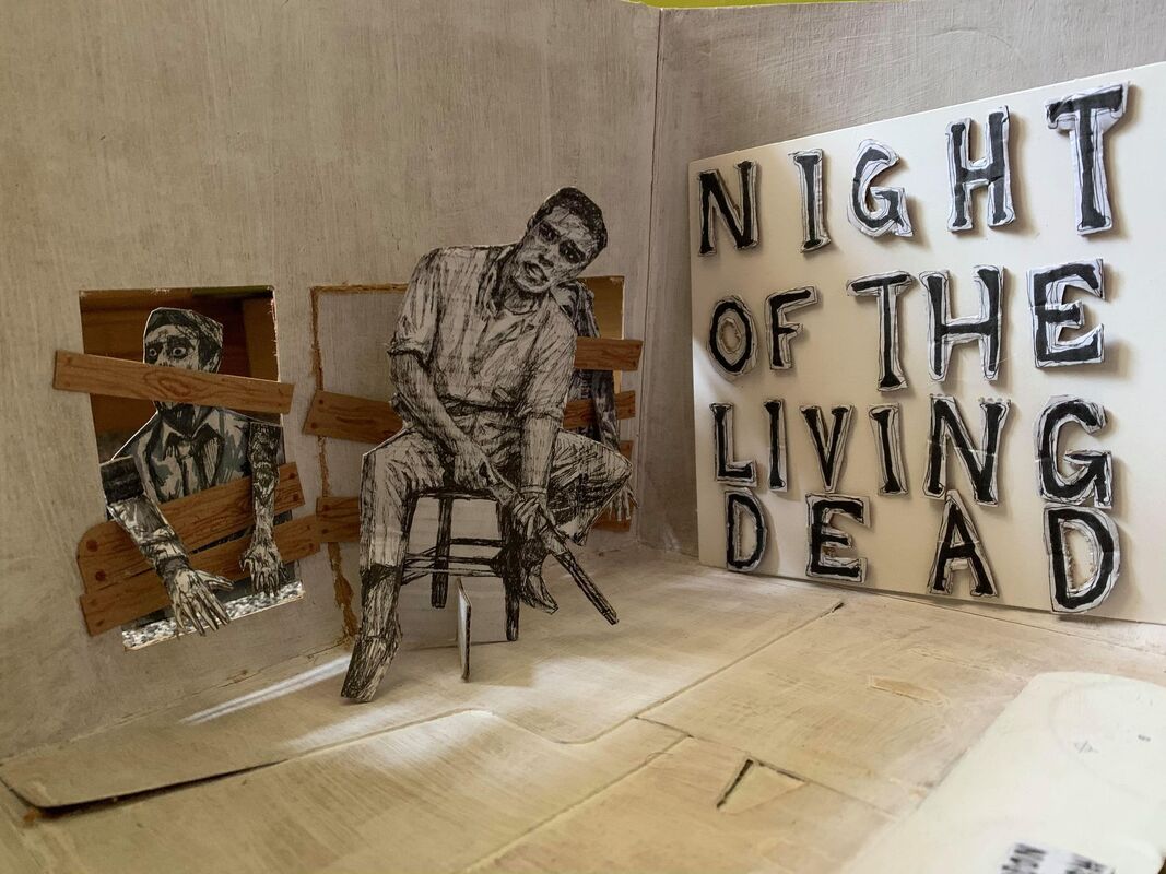
made a title card and tried using that in it, didn't like that in the end so i ended up making another one.
|
|
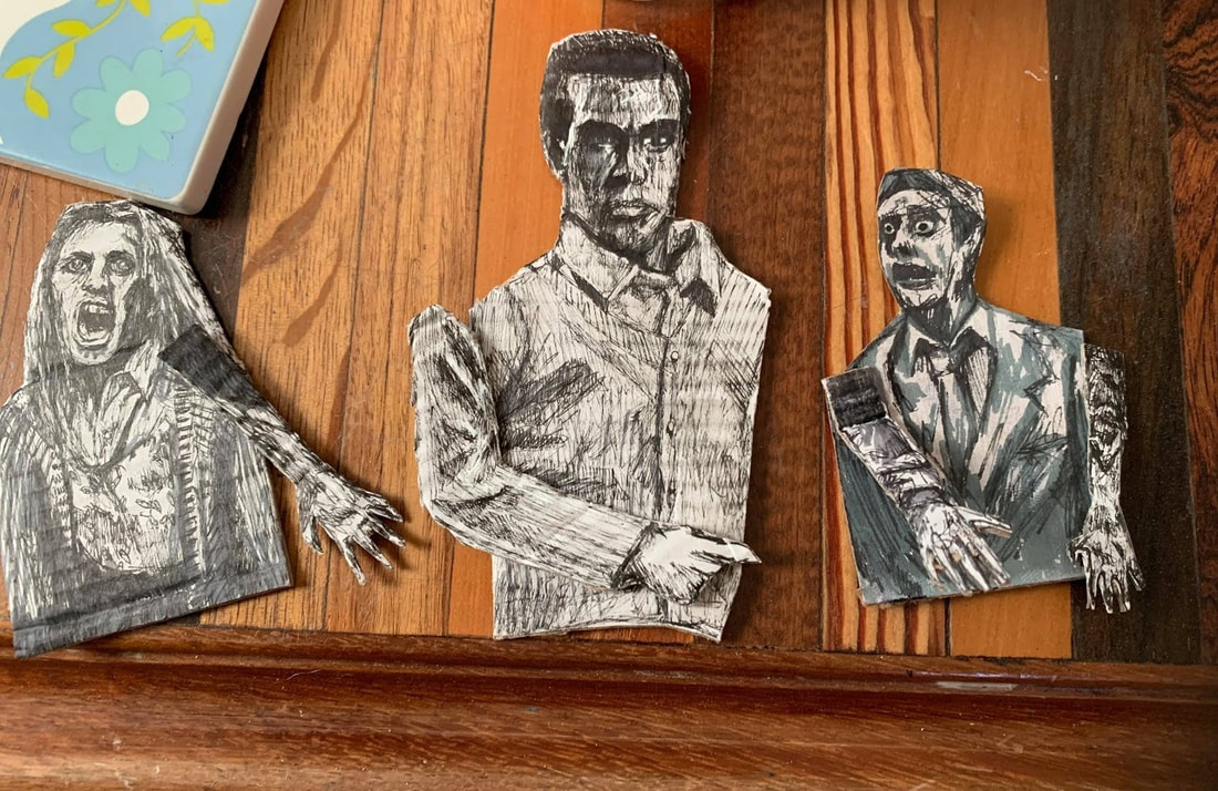
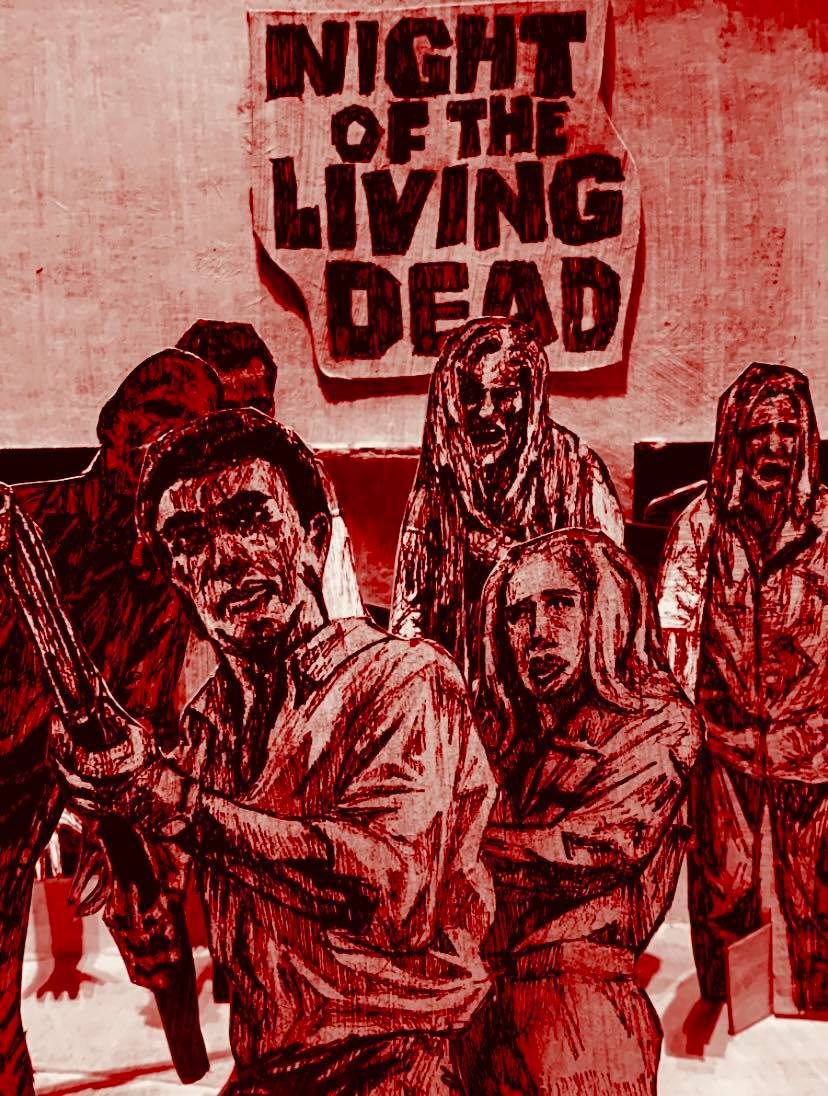
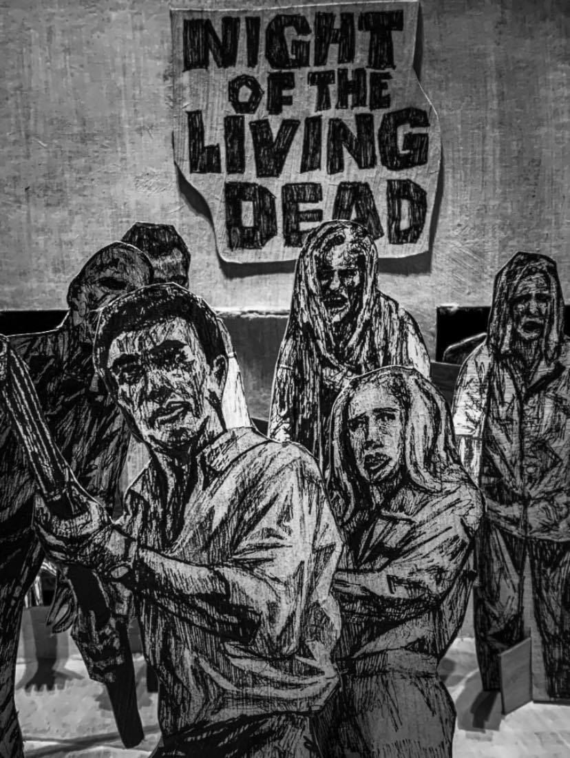
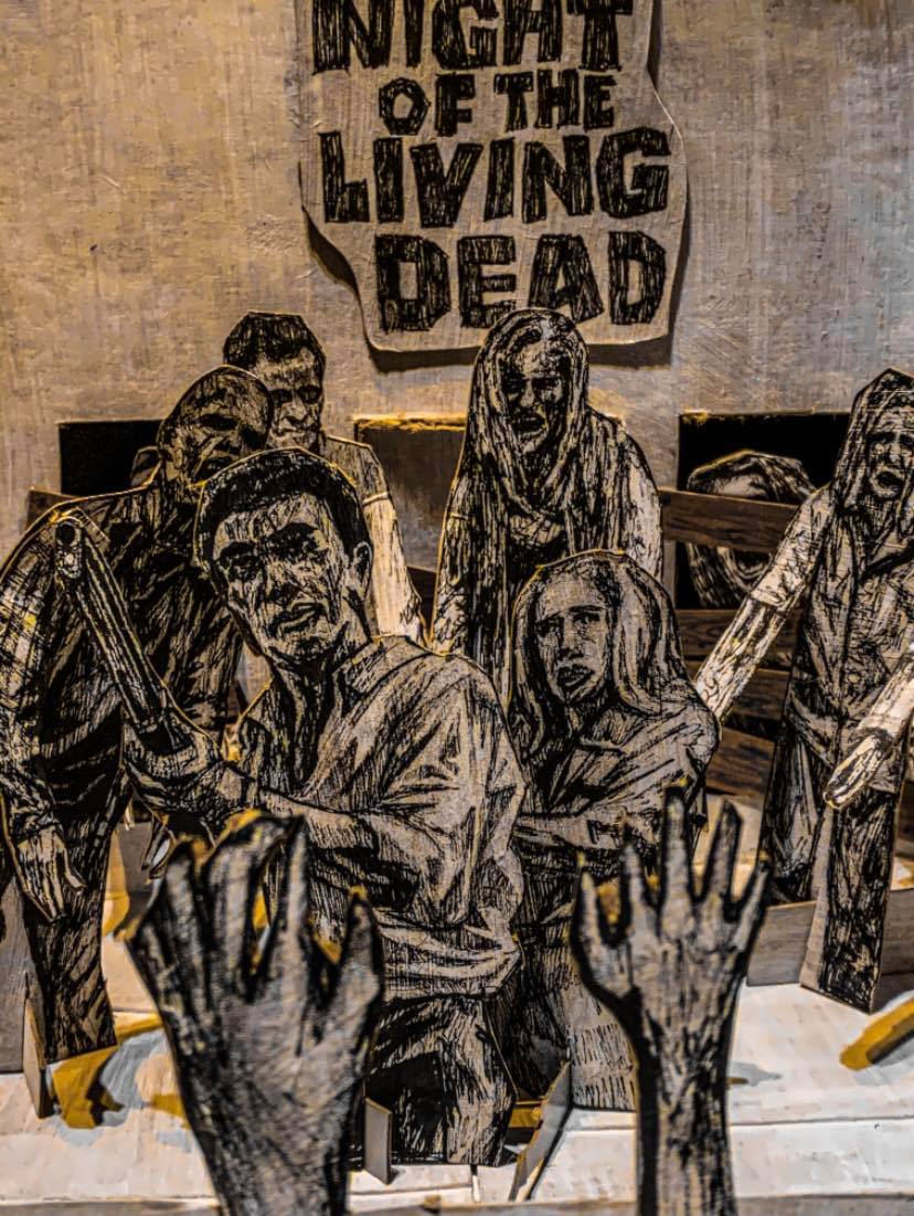
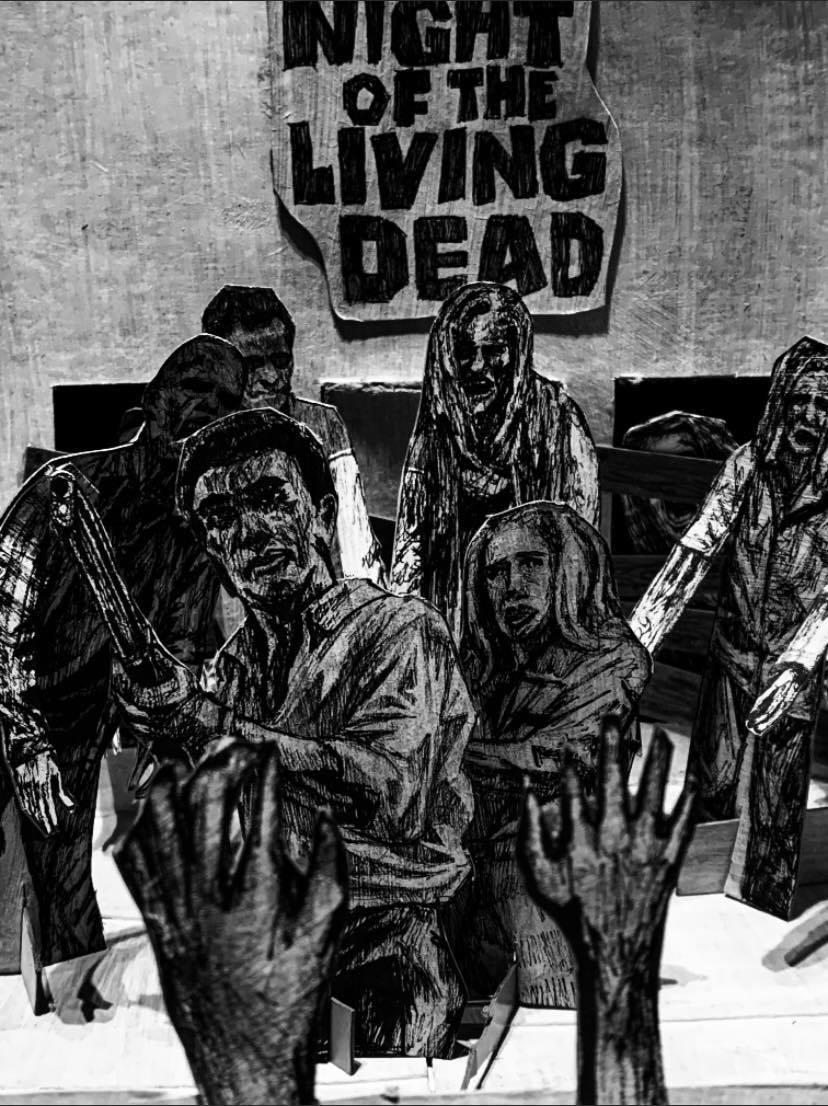
large development here, made many more zombies and little hands to hold in front of the camera, made a new version of the character and the female supporting character as well. At this point finally I was happy with it so it was just a matter of getting the right shot.
I also made a new title card, a smaller one.
You can see it promiently at the top of the poster.
I also made a new title card, a smaller one.
You can see it promiently at the top of the poster.
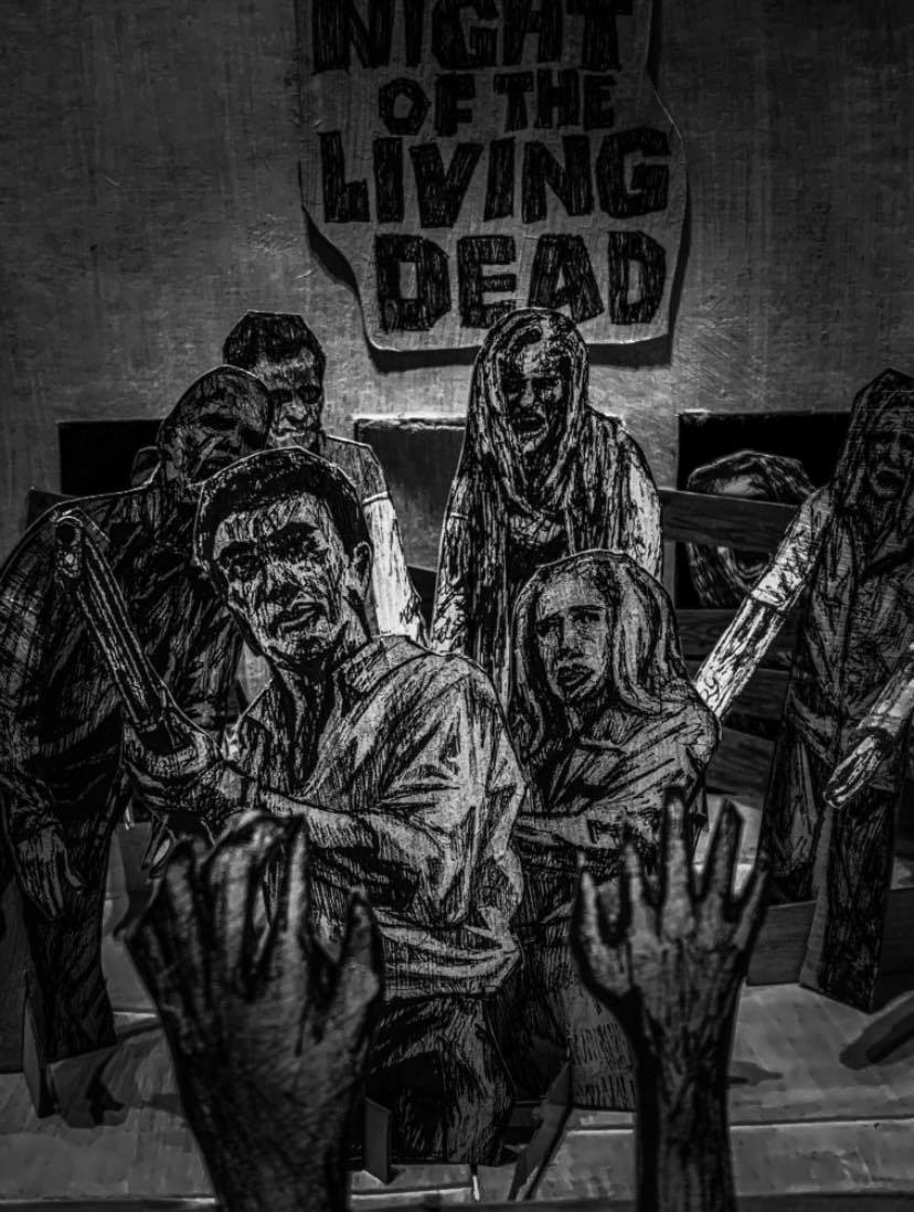
In the end this was the final design. I surprised myself in the end. I thought i'd absolutely hate it but alas. pretty happy of the final result.