|
|
Font:
You Magazine uses a Serif font which makes it sound important, sophisticated, the writing is quite slim but not dramatically so, So I wouldn't say that in this instance there's any example of font elongation to add meaning or put across a subliminal message of some sort. It seems pretty straight forward. The Rest of the font just look like 'Lato' which is very average and basic. It doesn't stand out at all, it's very easy to read.
Image:
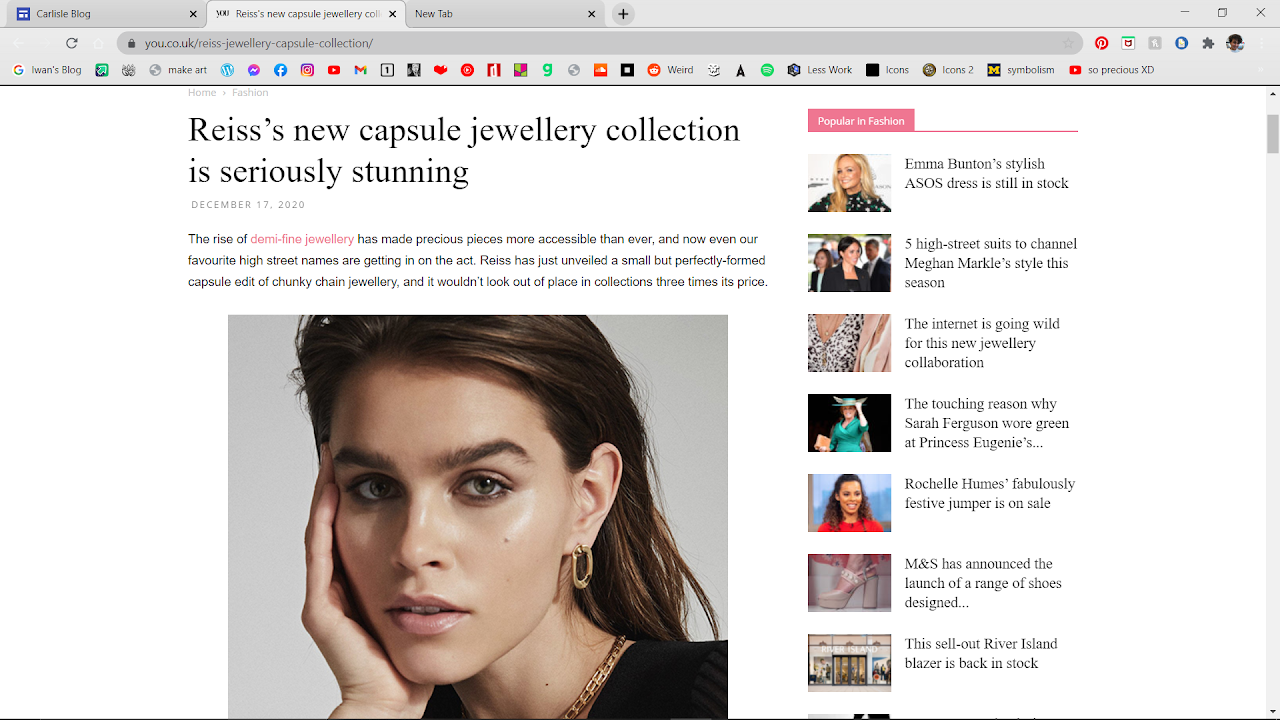
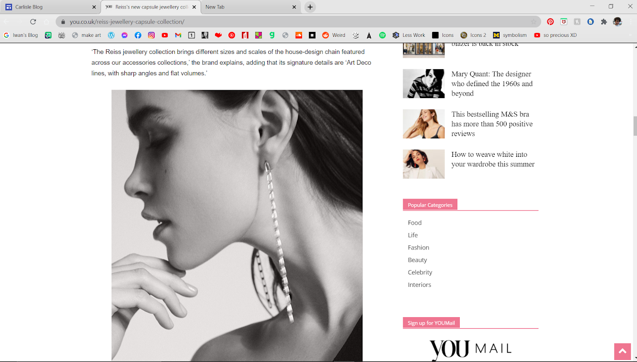
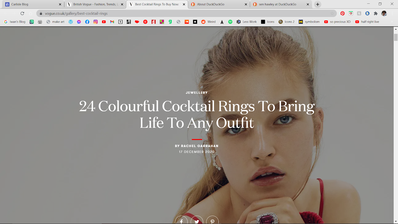
The images first focus on the woman then the product. That's an important technique I think I've just learned from this. look at the black and white image and then the one where she stares at the camera. You show first "look at this pretty woman" then you show the jewelry and the association with beauty carries over.
The image is of a white woman in her 20s. I could argue some things I was taught in creative media about it being representative of the audience they're aiming for, and I'd partially agree with that in the sense that they're selling this to women who are middle class. But I don't actually know if the woman is middle class, neither do I believe race is a factor a massive proportion of the time in the west's magazines.
The Writing's Content:
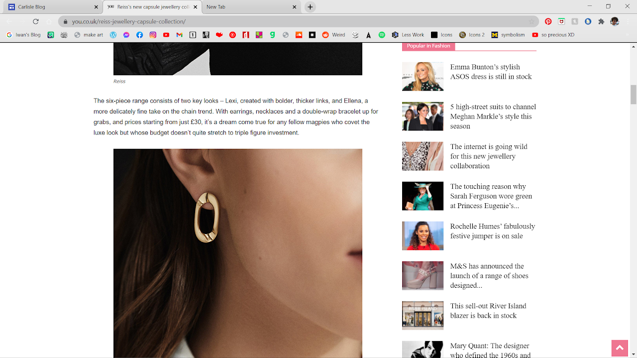
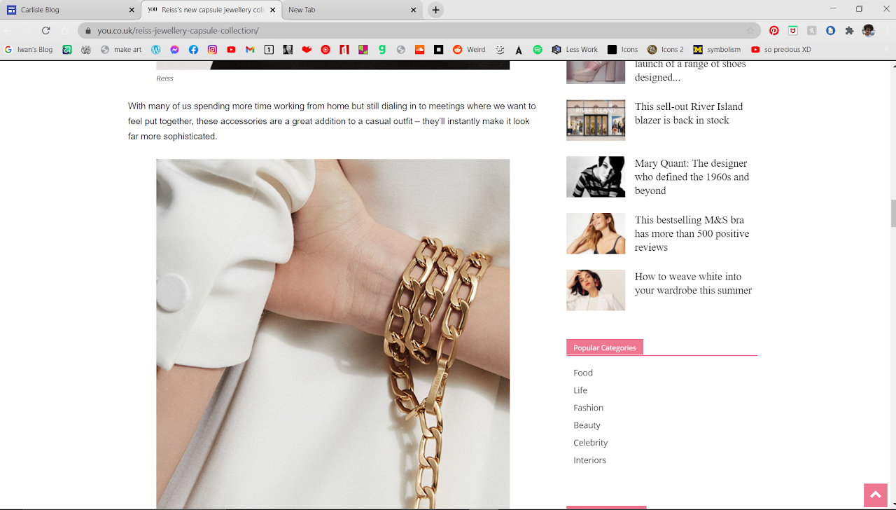
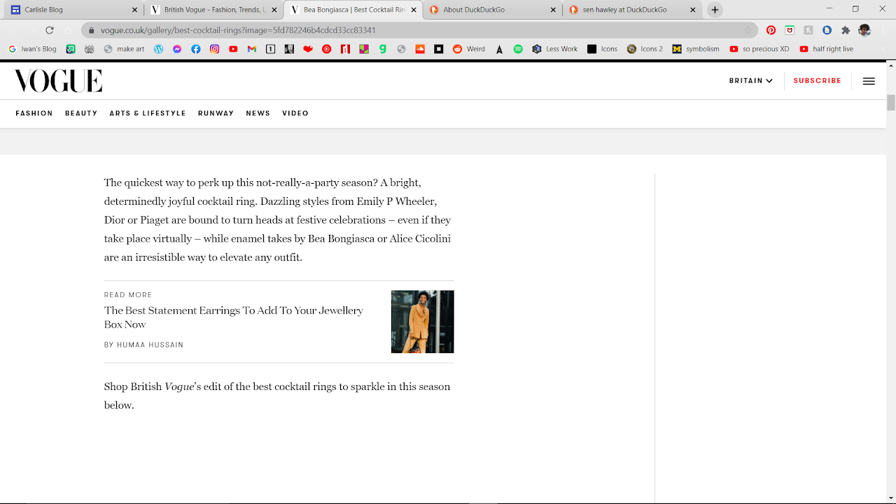
It praises cheap prices, tries to convince us to buy it saying it wouldn't look out of place in a collection three times it's value.
Font:
Vogue's using a serif font. Looks fancy and more upper class, then the actual non-title small print is predominantly more fancy than the last magazine, a lot more curves and serifs. This has the affect of looking fancy. The interesting part is that subheading break the mold of both fonts and look distinctly Roboto, which makes the subheadings stand out more from the contrast.
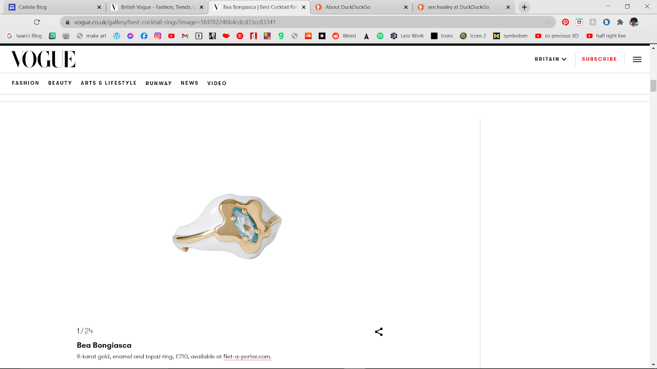
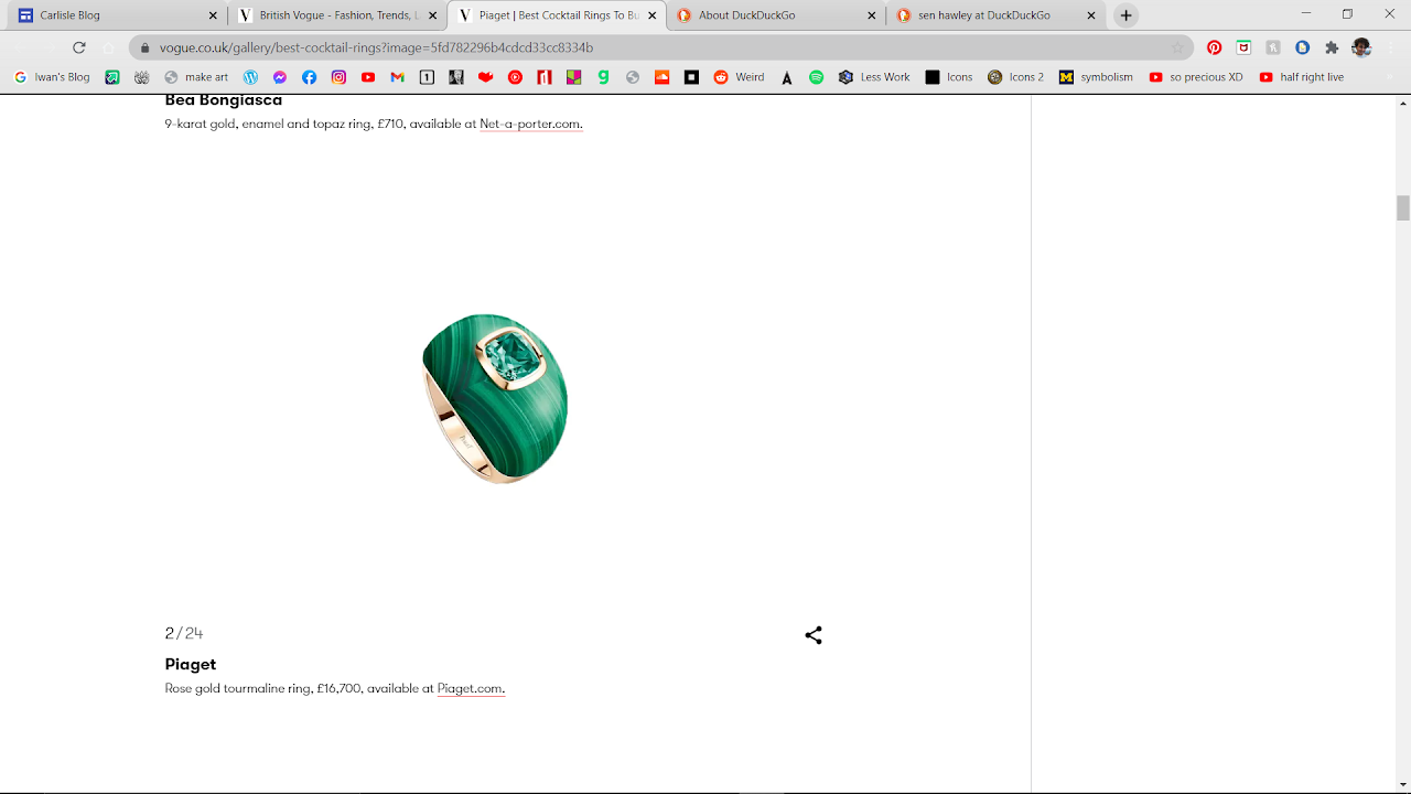
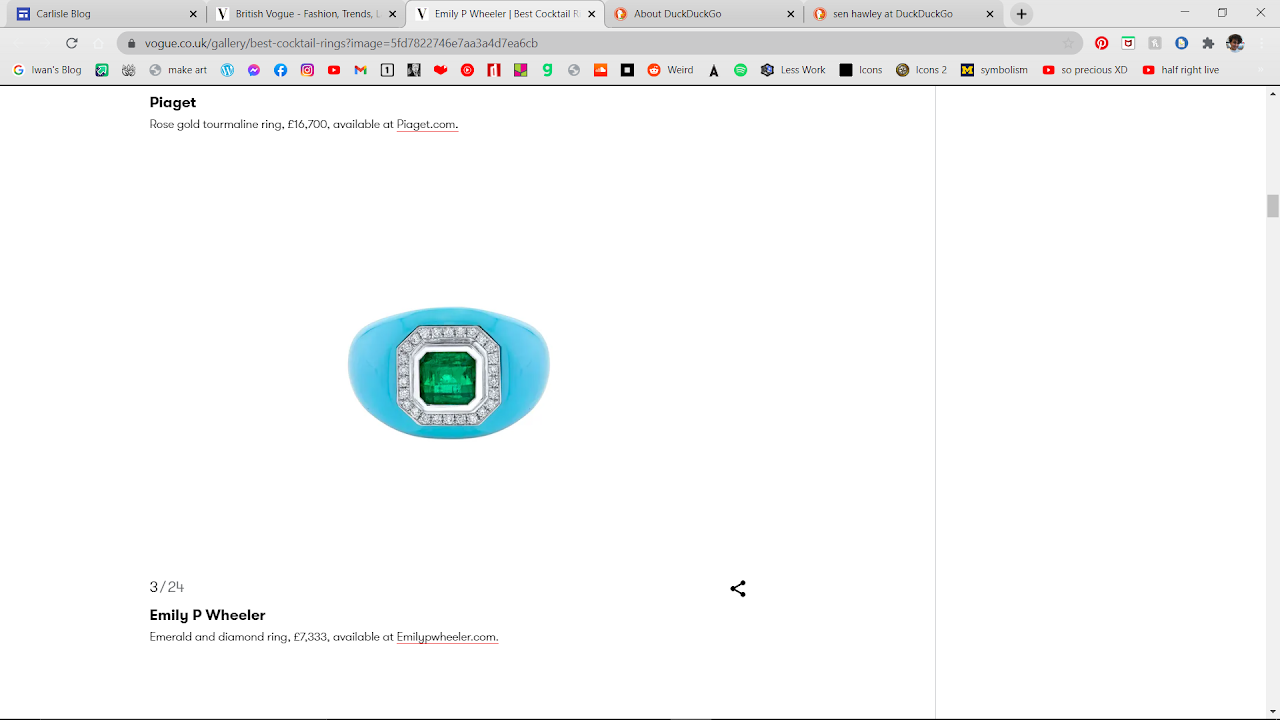
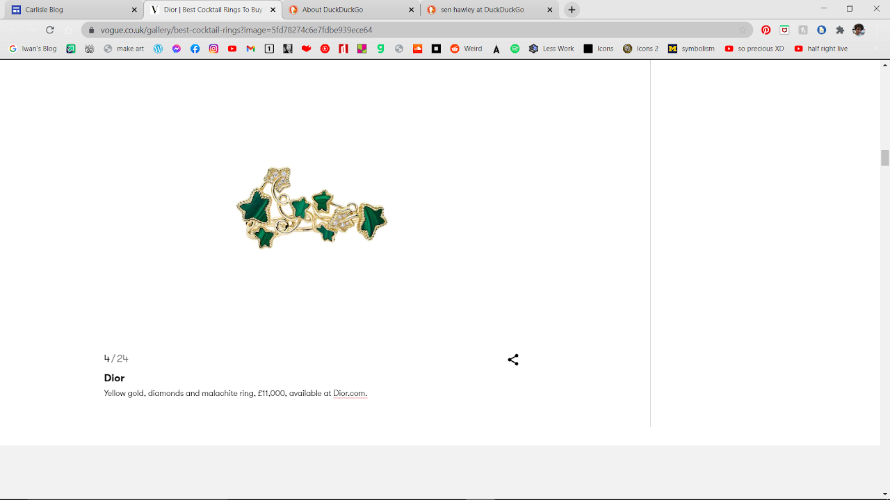
Image:there's one picture of a pretty woman with a ring, then images of rings with their prices. So again we see the tactic of showing a pretty model then the product with hope of lingering association with beauty.
The Writing's Content:The writing tries at first to be humorous, Since they don't want you to think about how useless a party ring will be during the covid age, where you can't attend parties.
Vogue's using a serif font. Looks fancy and more upper class, then the actual non-title small print is predominantly more fancy than the last magazine, a lot more curves and serifs. This has the affect of looking fancy. The interesting part is that subheading break the mold of both fonts and look distinctly Roboto, which makes the subheadings stand out more from the contrast.
Image:there's one picture of a pretty woman with a ring, then images of rings with their prices. So again we see the tactic of showing a pretty model then the product with hope of lingering association with beauty.
The Writing's Content:The writing tries at first to be humorous, Since they don't want you to think about how useless a party ring will be during the covid age, where you can't attend parties.